Status Audio
Status is a maker of high quality, minimalist audio products, and one of the fastest-growing direct to consumer headphone brands in the world. I’ve collaborated with Status since 2015 on various ongoing design, development, and creative direction projects.
Project History
2015–2020
In 2015, James Bertuzzi approached me to design and build an online store for his recently launched brand, Status Audio. Status had one product at the time, a cabled headphone called the HD One, and a few more in various stages of development.
The brand’s mantra, “No Logos. No Celebrities. Just Sound”, was a subtle jab at one of the most popular audio brands at the time, whose headphones featured a prominent logo on the outside of the earcups and were heavily endorsed by paid celebrities. The Status headphones, on the other hand, were unbranded, marketed and sold directly to consumers, and offered the same quality at one-fifth of the price. I was sold.
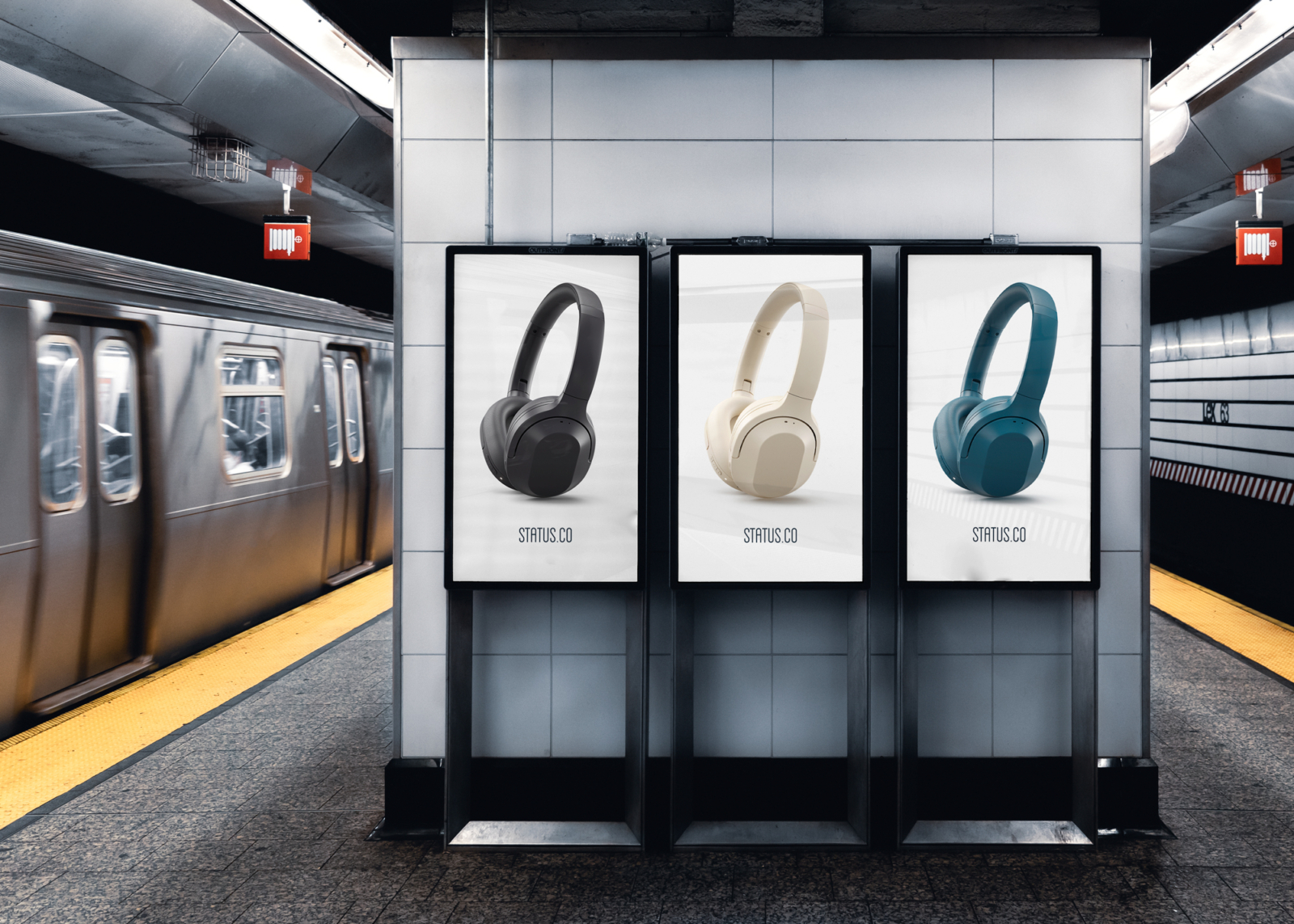
I designed the first iteration of the online store around the brand’s core tenants and initial product offering. The aesthetic was hyper-minimalist, utilizing sparse color, clean photography, a solid grid foundation, and an abundance of negative space. The new site was fully responsive to mobile, had a much better user experience than the existing site, and helped establish the early stages of the brand’s visual identity. Post launch, traffic to the site and subsequent sales grew exponentially.
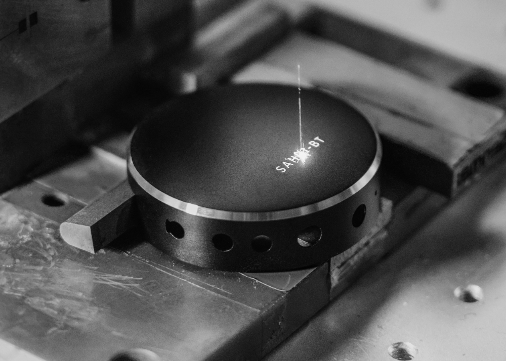
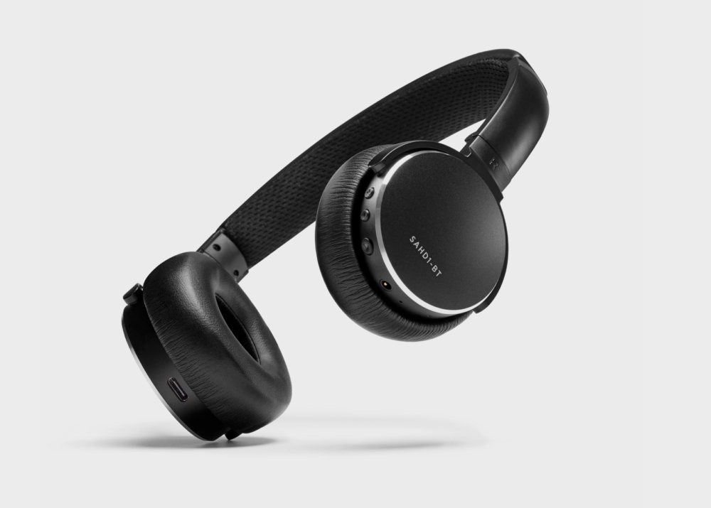
In addition to the new site, we created a product ID concept featuring a small typographical code laser-etched into the headphones, packaging boxes, and carrying cases. These were the only marks on the otherwise unbranded headphones and helped set Status apart from others on the market.
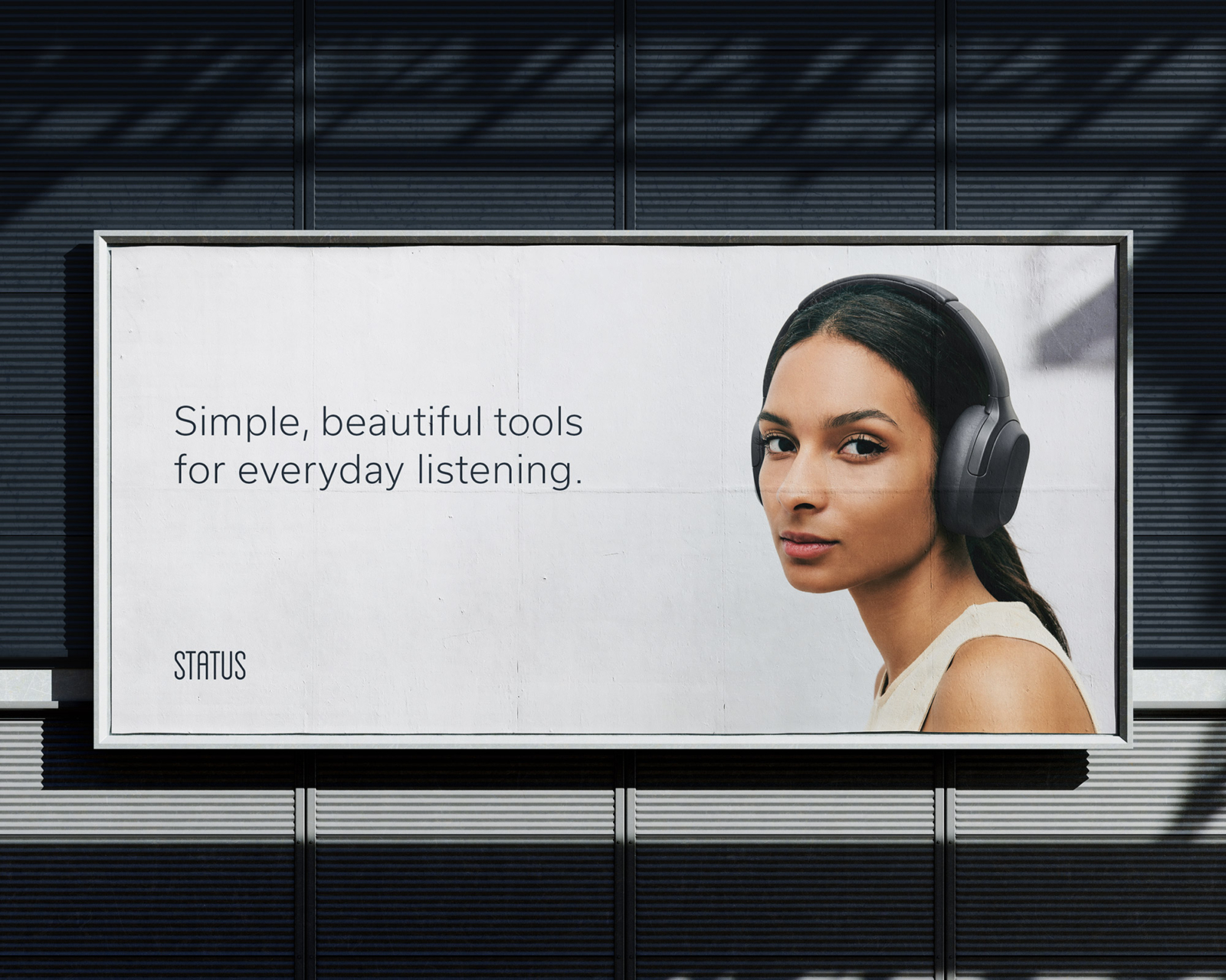
Over the next couple of years, as bluetooth technology improved, the original product line was replaced with updated models. This presented an opportunity to design a new logo and color palette, both of which complimented the overall brand aesthetic and set the tone for future releases. The actual products would still remain logo-less but the website, packaging, and marketing required updated branding. After sketching hundreds of concepts, I focussed on a singular wordmark with characters and curves designed to mimic the oscillating flow of a soundwave pattern. The soundwave pattern itself was then simplified for use as a secondary brandmark. Over the years, we’ve used that same original pattern as a guide for creating various brand graphics and typography.
Eventually, we moved on to packaging and revamped the entire customer unboxing experience, which included redesigned boxes, sleeves, and printed inserts. The packaging was designed as part of a universal system that is easily replicable, which allowed Status to maintain consistency despite manufacturing at a variety of overseas factories.
In 2019, we revamped the site due to numerous changes, including upgrades in Shopify’s ecommerce platform, the improved visual identity, new products, and a big shift from desktop to mobile in how customers were shopping. The redesigned site maintained the original architecture but was further optimized for mobile and added dynamic content sections to make the front-end much easier for in-house staff to frequently edit.
2020–Ongoing
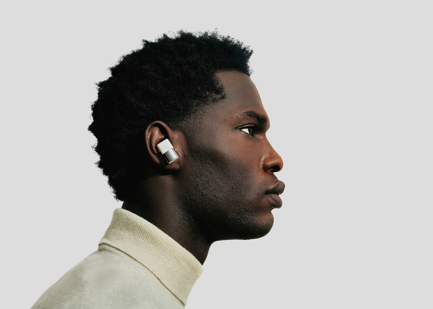
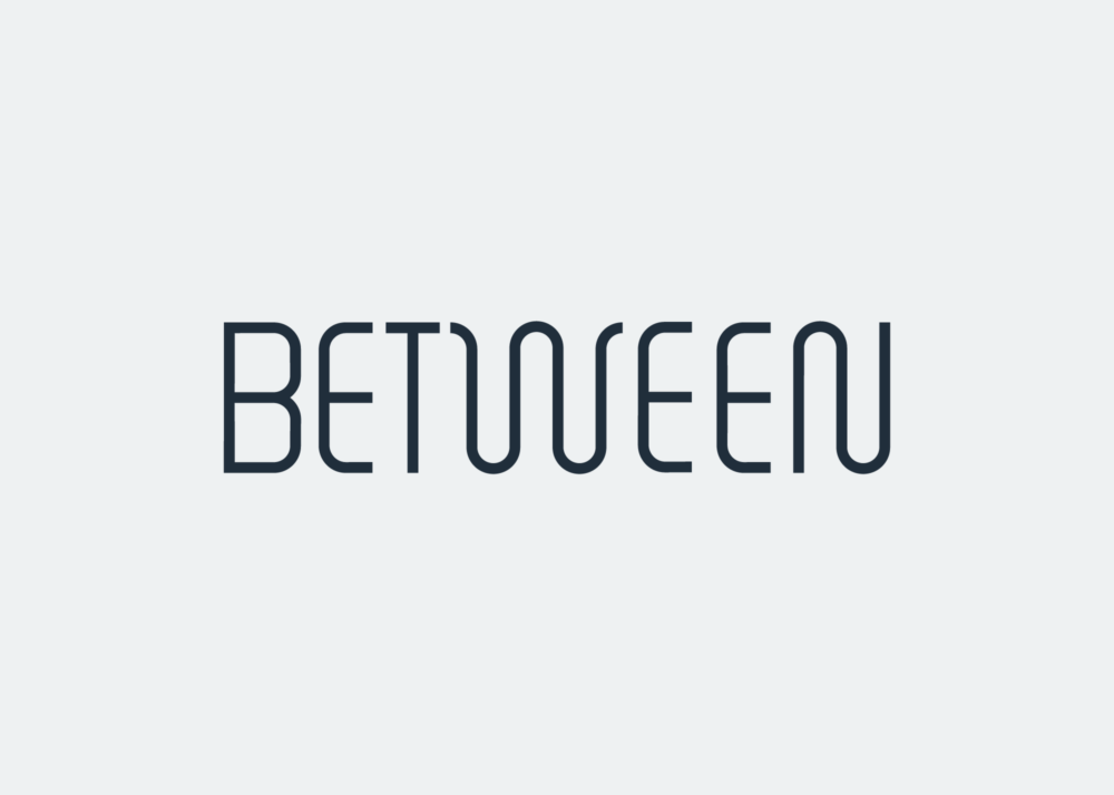
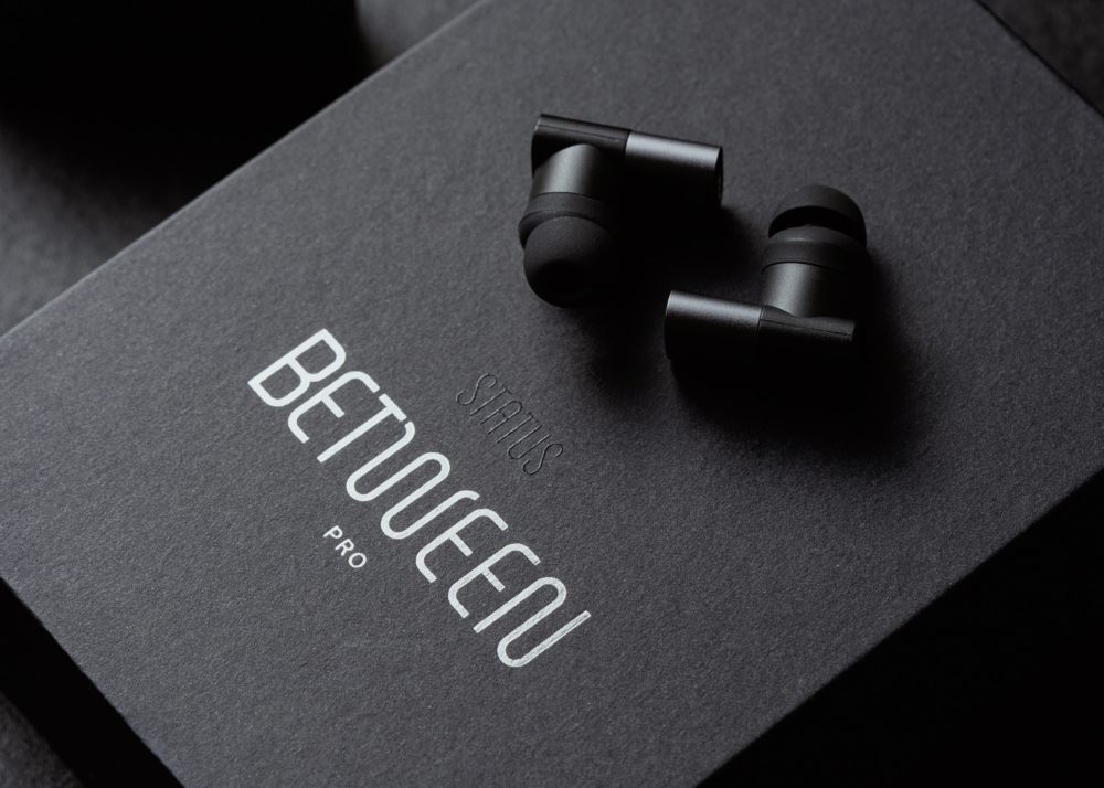
In 2020, Status launched the Between Pro, the first product in their new line and entry into the future of headphones: true wireless earbuds. With plans to release more products under the new brand, Status required visual tools for differentiating Between products from their existing headphones, as well as a way to emphasize the brand’s entry into the new industry-disrupting category. A full case-study for the Between project can be found here.
Over the years
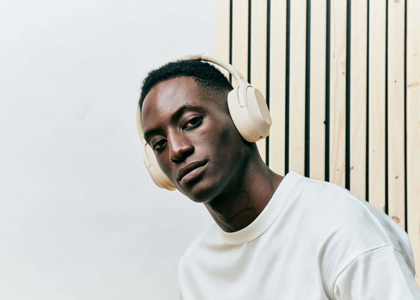
Status has produced numerous headphone models and accessories, all with corresponding packaging, imagery, and marketing treatments that I’ve designed or collaborated on. Since 2015, I’ve helped Status launch 4 versions of the website, and over 50 subtle theme variations, which along with the visual identity, have received praise from design, technology, and product related outlets, and were awarded an A’Design Award for Advertising, Marketing and Communication. Over the last 8+ years, Status has experienced triple digit annual growth to become a DNVB consumer-audio leader.
Front Matter
- Brand Identity
- Brand Color
- Brand Illustration
- Brand Typography
- Layout & Print
- Logo Design
- Packaging
- Signage
- Style Guide
- Direction
- Art Direction
- Creative Direction
- Photography Direction
- Web & Digital
- Shopify
- Shopify Plus
- Web Design
- Web Development
- Site Inspire
- Mindsparkle Mag
- Minimalissimo
- A’Design Awards
- Awwwards
- Design Ideas
- Industrial Design Friends of
- Photography Kilian Son Matt Tran Marshall Troy Tristan Green
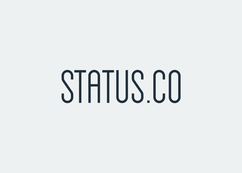
The primary logo is a wordmark with characters and curves designed to mimic the oscillating flow of a simple soundwave pattern. The wave pattern itself was eventually used throughout the visual identity.
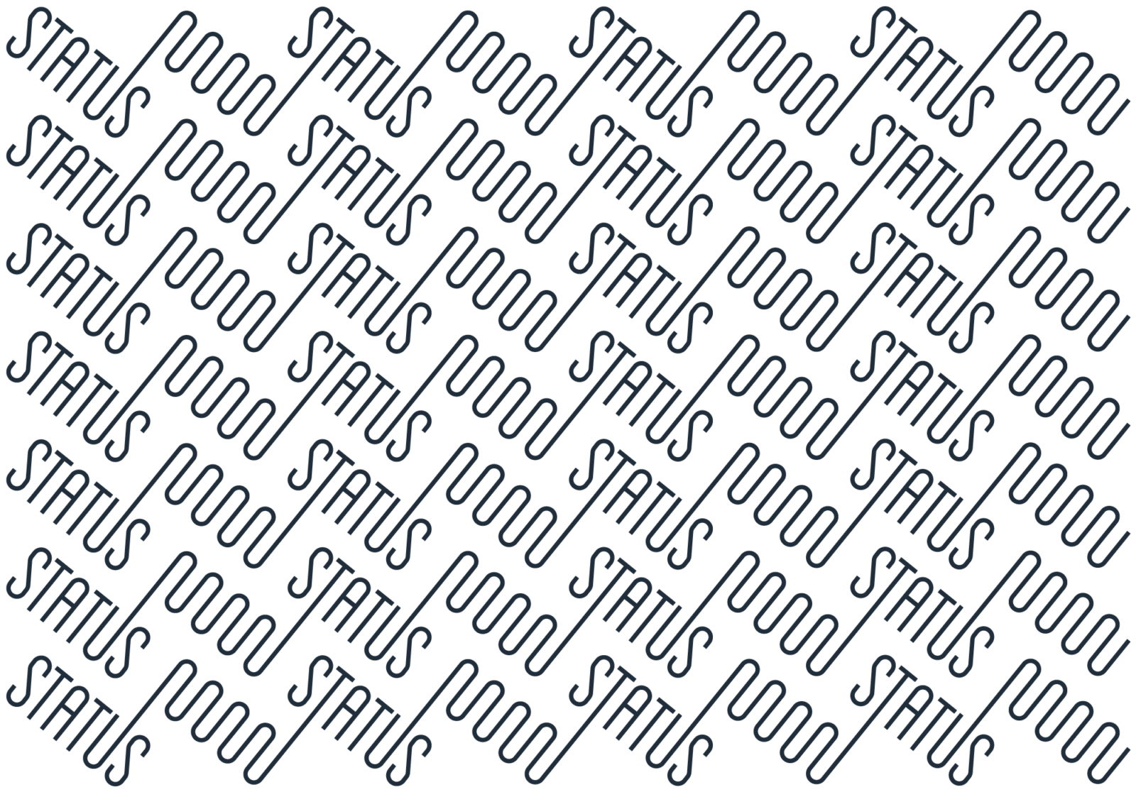
The soundwave pattern that inspired the wordmark was used as a guide for creating an entire character set, which we've referenced over the years for designing consistent on-the-fly graphics, type treatments, and more.
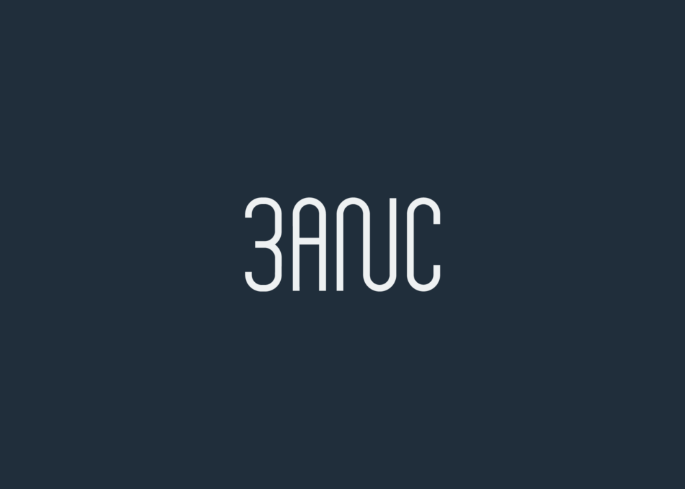


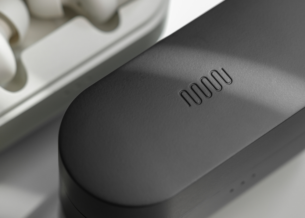
The secondary brandmark can be found as a "reveal" on the inside of packaging, etched into charging cases, or as a small identifier on various collateral.

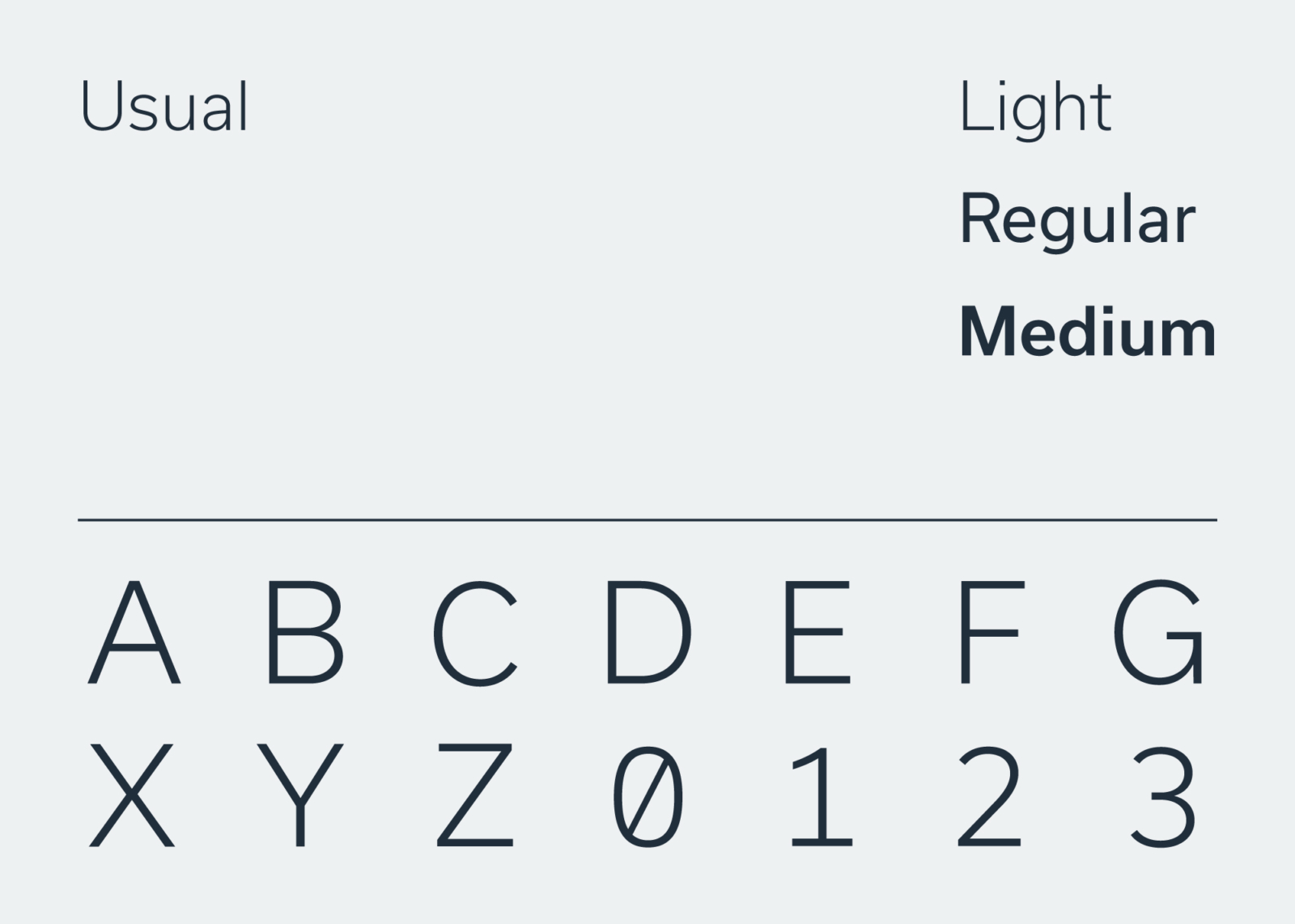
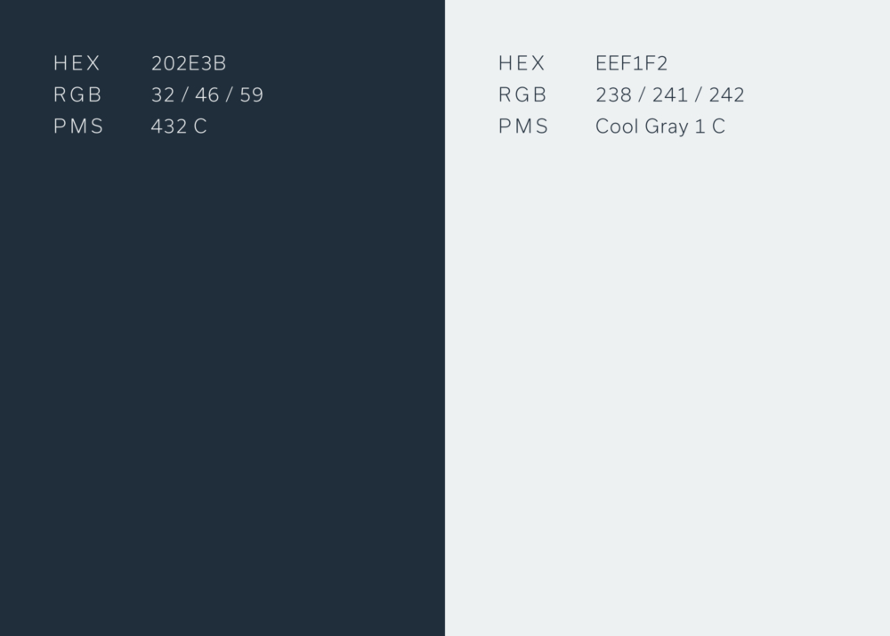
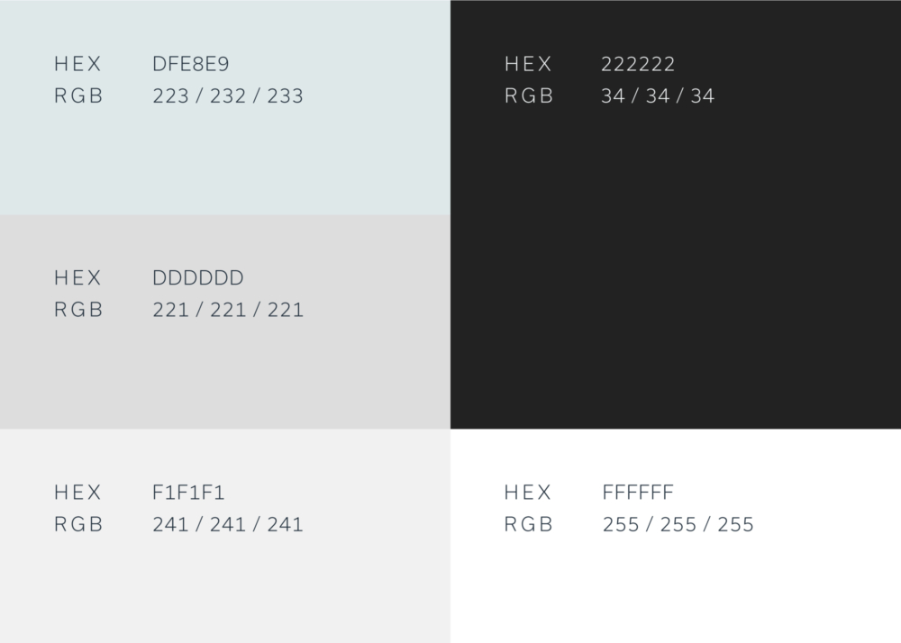
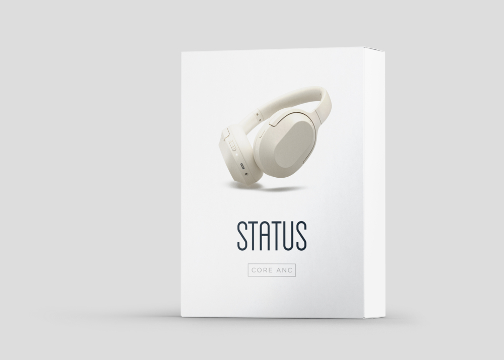
To complement the no-frills aesthetic of the Status products, I focussed on a neutral color palette and modern sans-serif typeface. Eventually, as the product line and marketing efforts expanded, additional colors and print-ready equivalents were introduced.
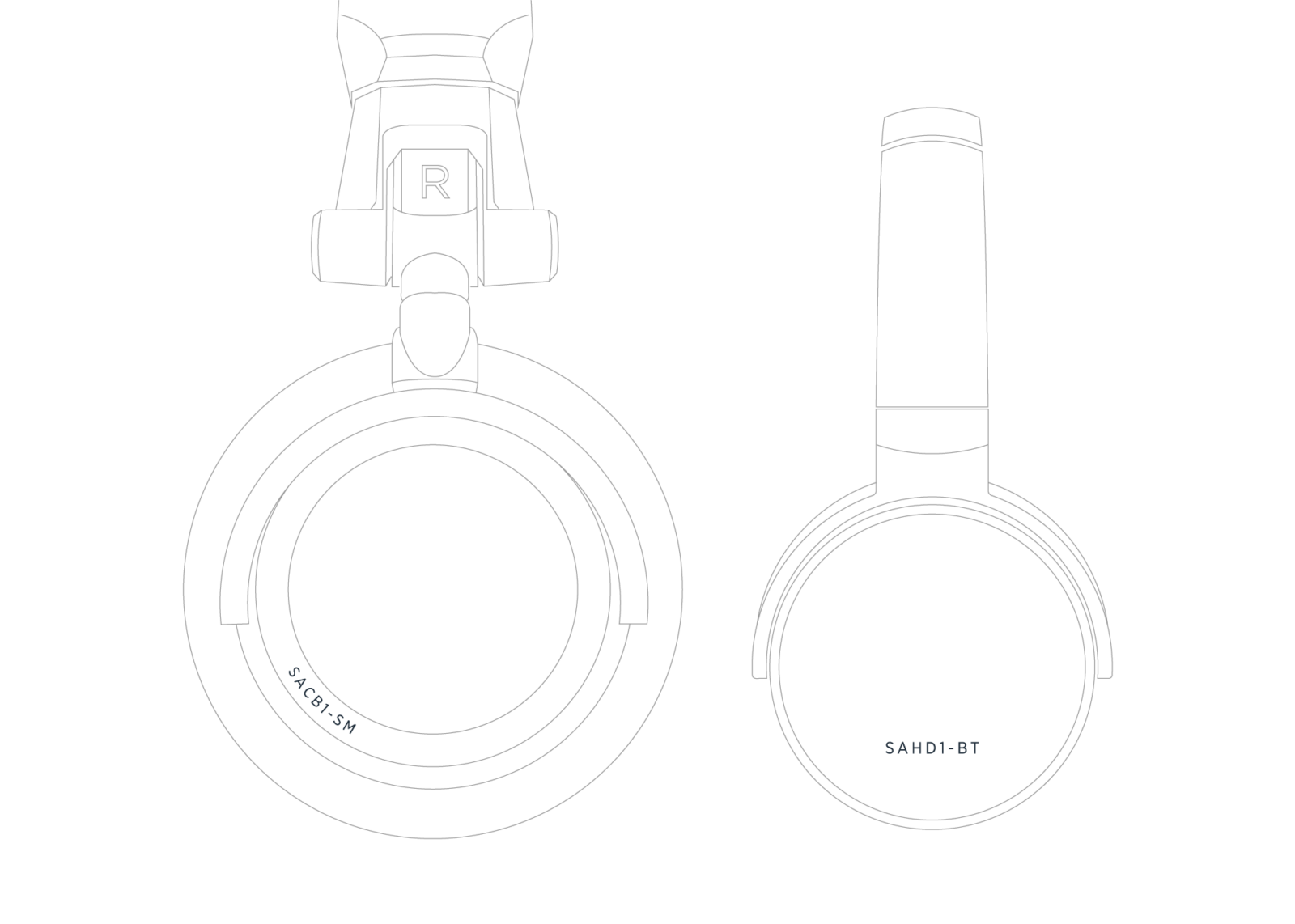
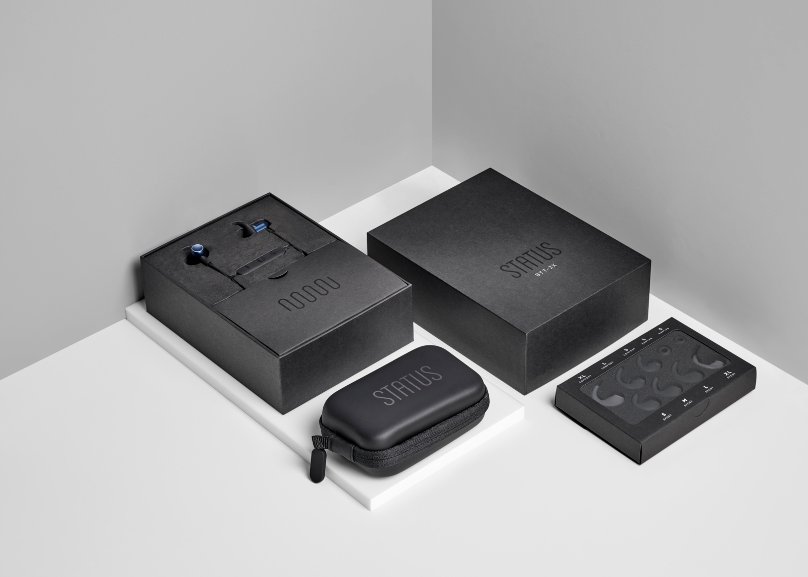
One of the early developments of the visual identity was a product ID concept, featuring a small typographical code that is laser-etched into the headphones and packaging. These are the only marks on the otherwise unbranded products.
Packaging
The Status packaging was designed with production consistency in mind, utilizing a universal system that accommodates a variety of products in different shapes and sizes. The packaging is easily replicable which allows various overseas factories to produce the same look and feel.
The Online Store
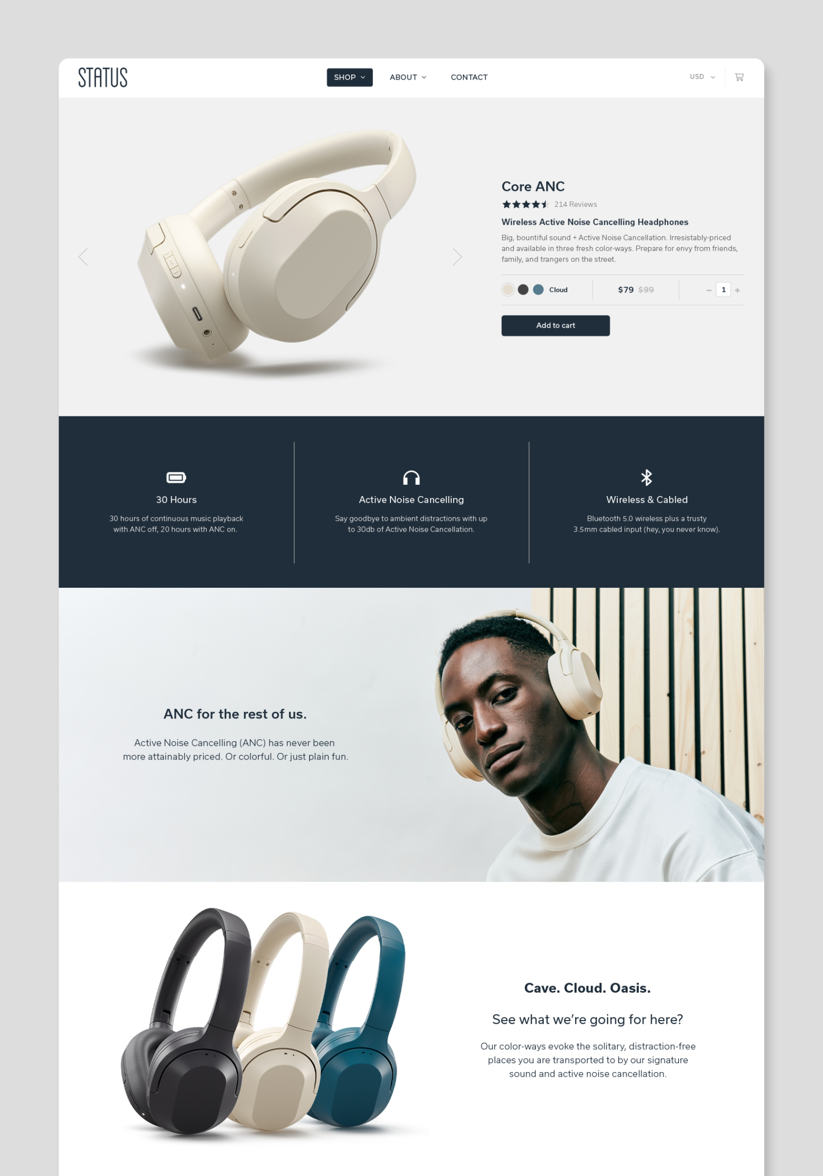
As a direct-to-consumer brand, the primary point of sale for Status is their Shopify-based website. The custom site was designed to reflect the brand’s core tenants and product offering, while providing an efficient purchasing process for customers. Like the products, the overall aesthetic is hyper-minimalist, utilizing sparse color, clean photography, a solid grid foundation, and an abundance of negative space.
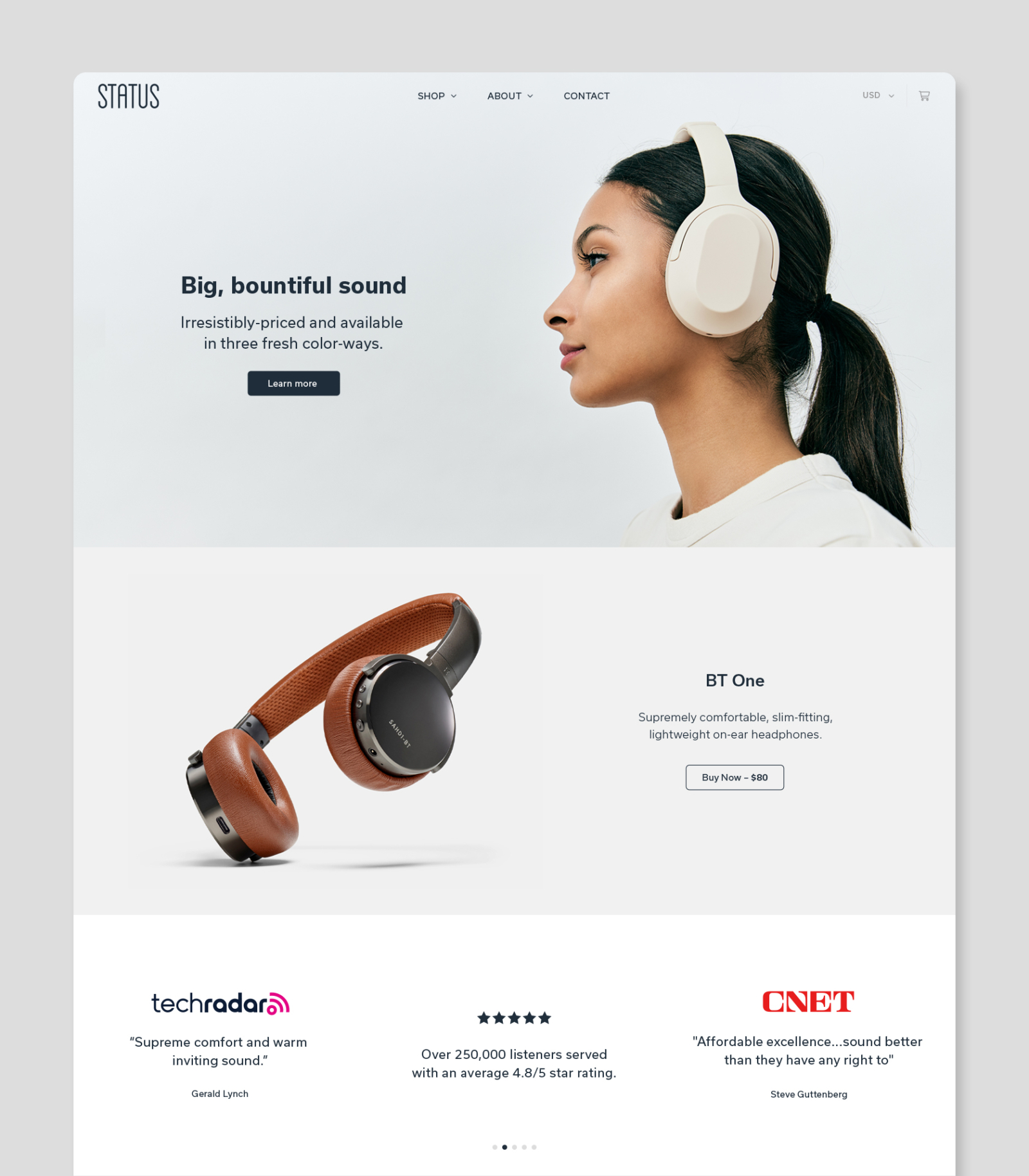
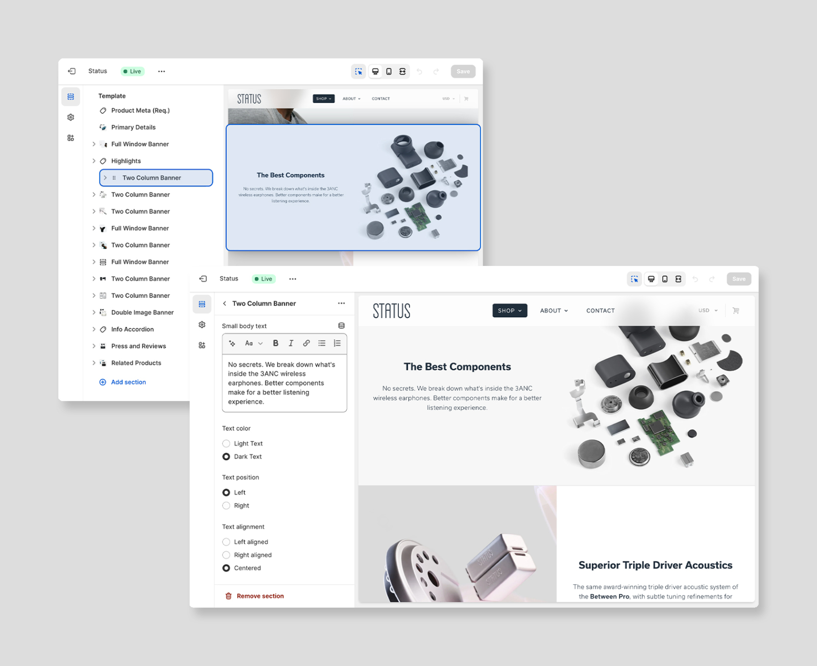
Various dynamic sections were developed site-wide so that admins can easily create and organize blocks of content. This is especially helpful on product pages where unique features help drive sales. Content can be refreshed often without touching any code.
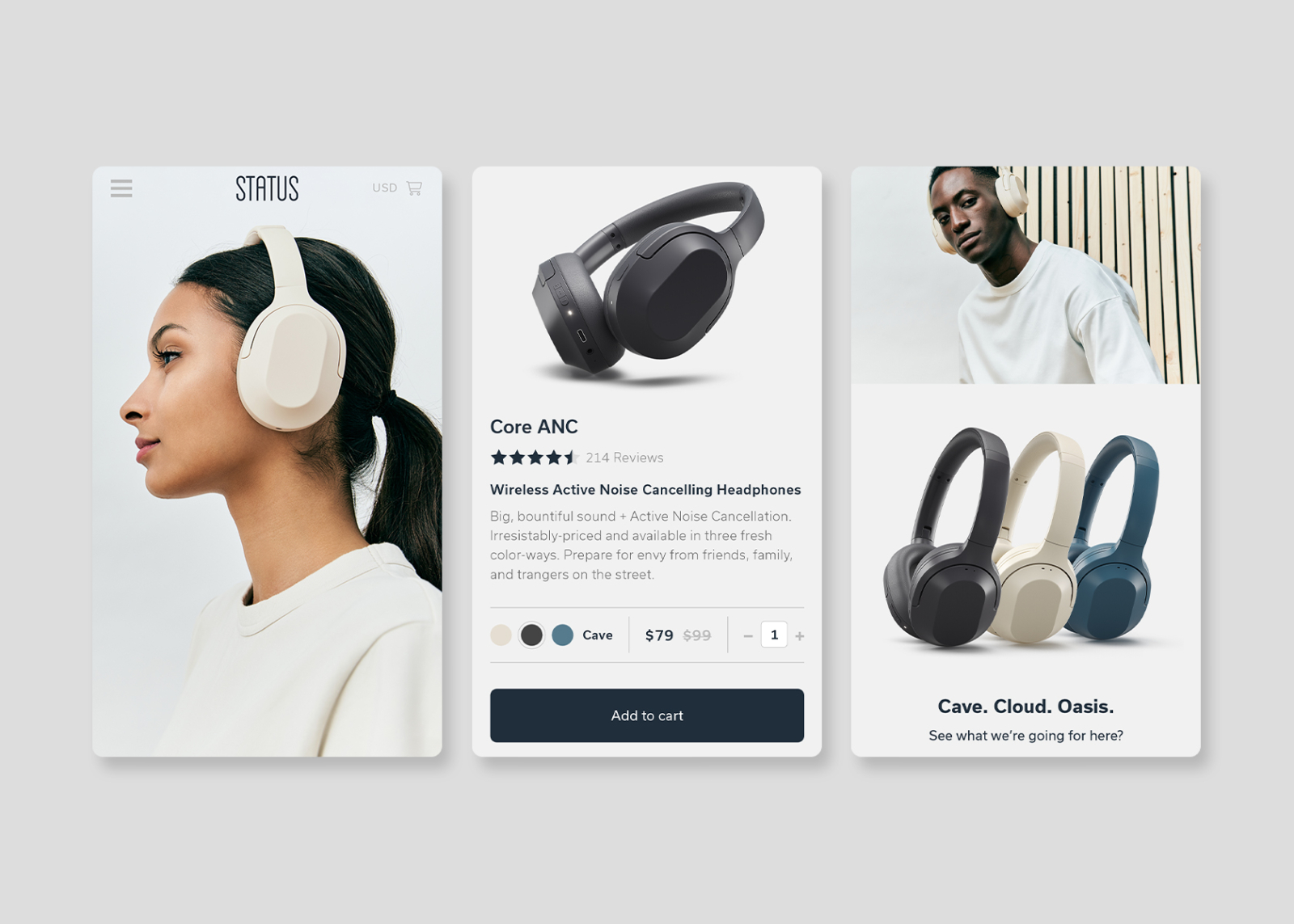
The Status website is fully responsive to mobile, adapting to the size of the device it's being viewed on. Over the years, as online shoppers have gradually switched from desktop to mobile, we've optimized the site to increase conversions on smaller devices.
Status has produced numerous headphone models and accessories, all with corresponding packaging, imagery, and marketing treatments that I’ve designed or collaborated on. Since 2015, I’ve helped Status launch 4 versions of the website, and over 50 subtle theme variations, which along with the visual identity, have received praise from design, technology, and product related outlets, and were awarded an A’Design Award for Advertising, Marketing and Communication. Over the last 8+ years, Status has experienced triple digit annual growth to become a DNVB consumer-audio leader.