Discern
Discern is a web-based platform that uses intelligent monitoring and automation to make U.S. corporate compliance more efficient and easier to manage. I worked with Discern in 2022/23 to design the brand’s visual identity.
Summary
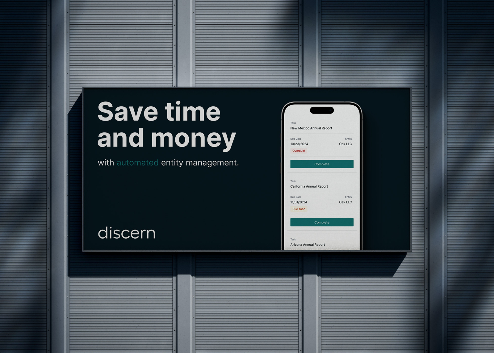
Corporate compliance is often a burden for growing companies due to its complexity and the resources required to manage it. Discern’s web-based application alleviates this burden by automating the monitoring and filing of foreign registrations, annual reports, and franchise tax.
From 2022-2023, I worked with Discern to design the brand’s visual identity and accompanying style guide.
The Discern project started with a series of discovery exercises focussed on their product, brand approach, and target segment. Working closely with Discern, we concluded that the visual identity should reflect the trustworthiness and professionalism that is associated with brands in similar industries while emphasizing their modern, technology-driven approach.
The visual identity, comprising a wordmark, brandmark, combination logos, color palette, brand typography, and favicons, embodies the key characteristics and goals identified, while providing brand cohesiveness and ample room for growth.
Front Matter
- Client Discern
- Location New York, NY USA
- Industry TechnologyEntity Management
- Completed 2023
- Brand Identity
- Brand Color
- Brand Illustration
- Brand Typography
- Logo Design
- Style Guide
- Direction
- Art Direction
- Type DisplaayRasmus Andersson
- UX / UI Sydney DeBolt (Discern)
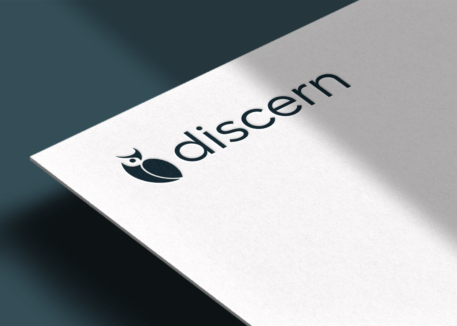
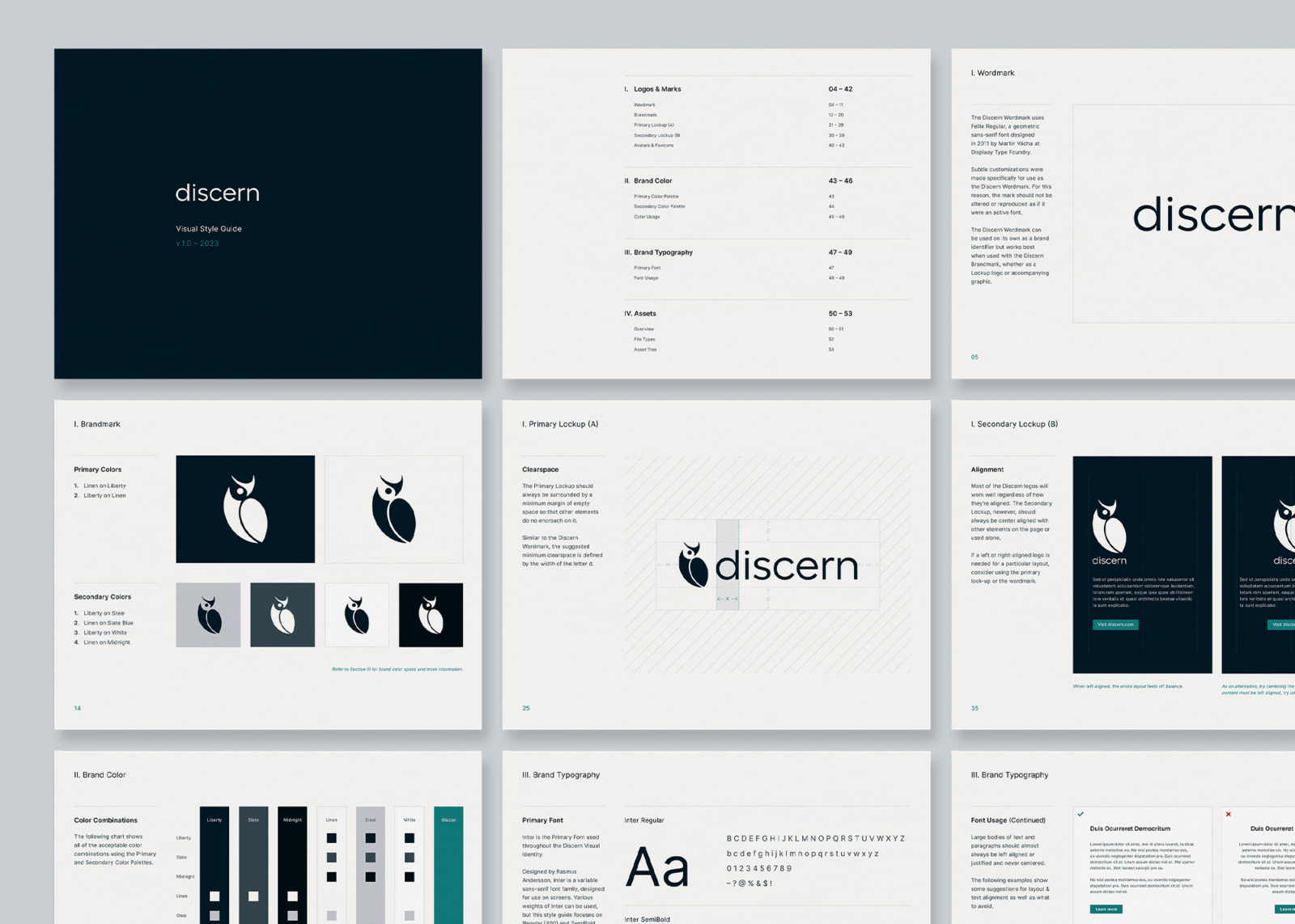
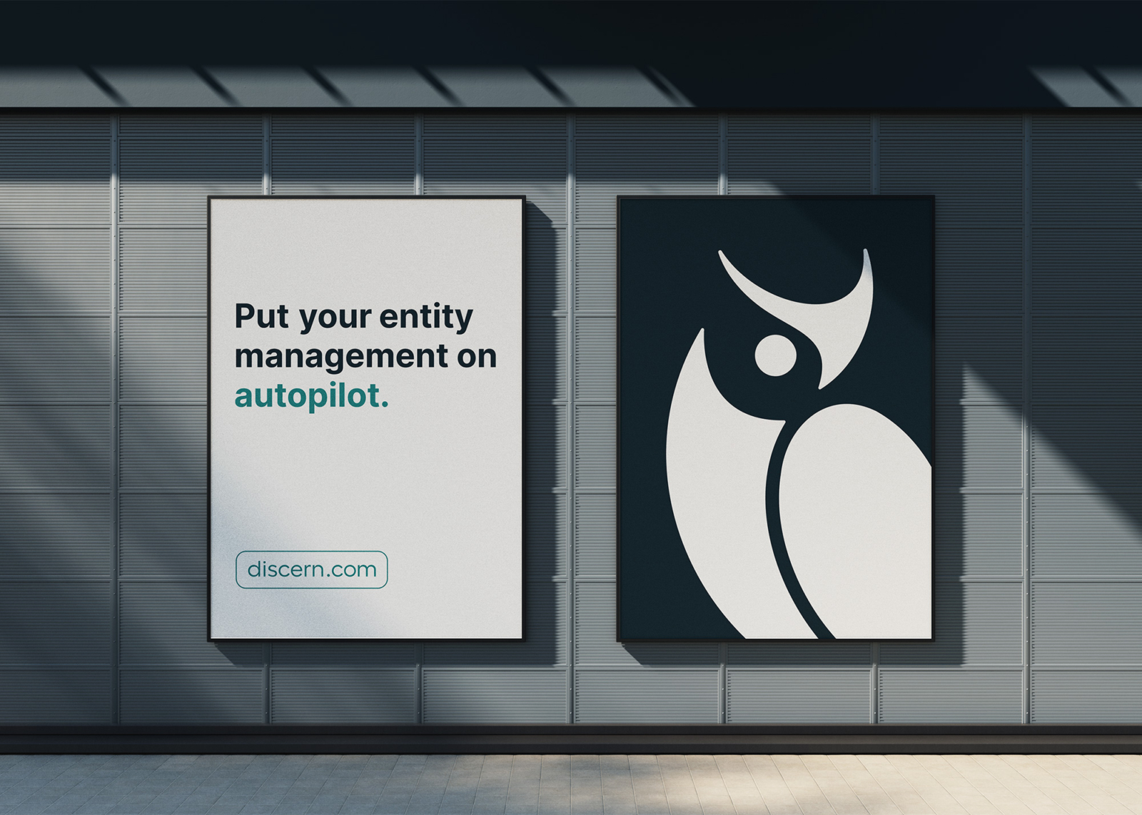
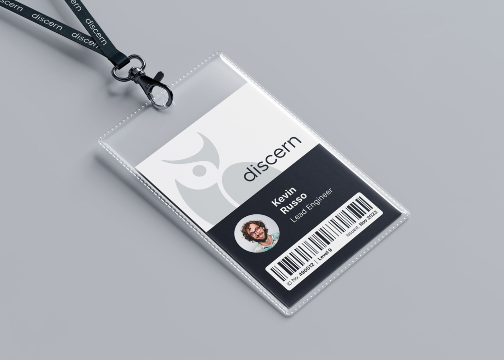
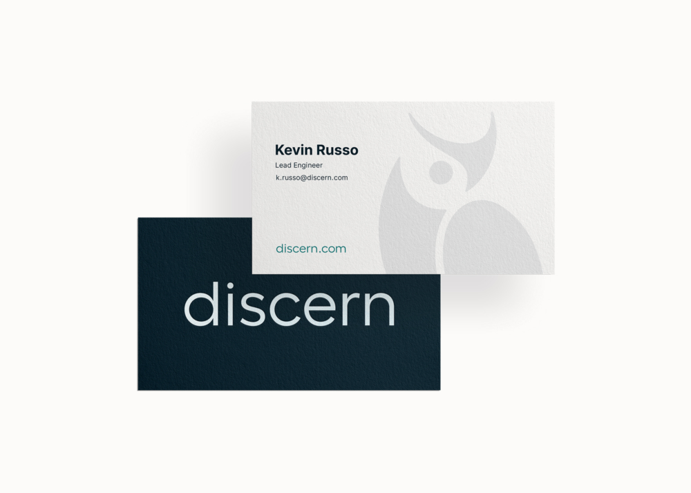
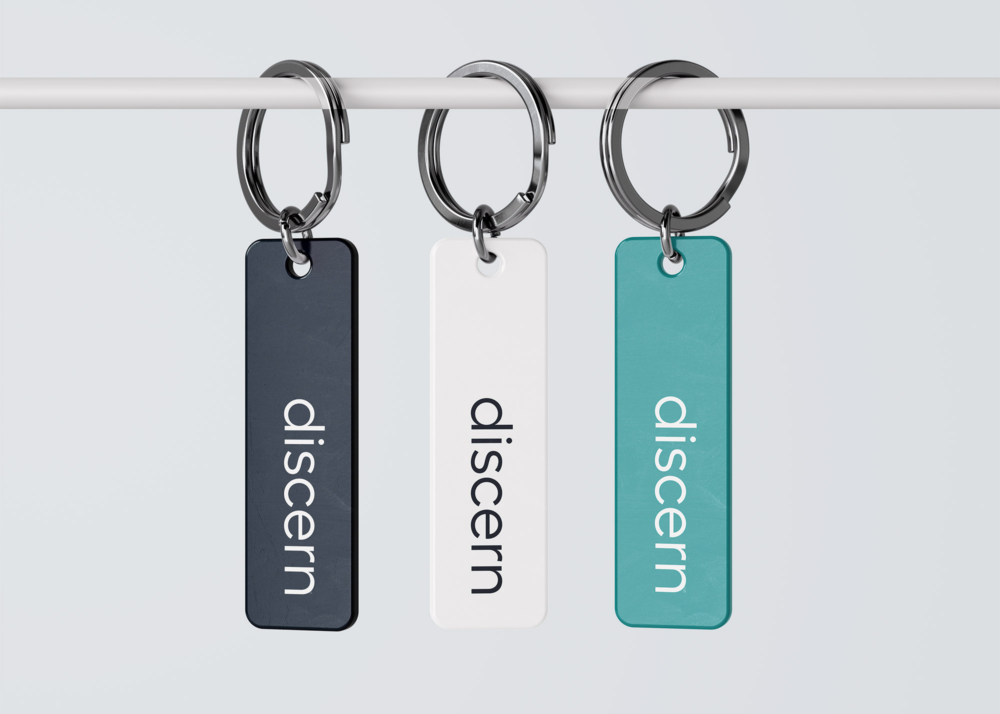
The Discern logos were designed to invoke helpfulness, trust, and reliability. After evaluating hundreds of typefaces for the wordmark, we chose Fellix by Displaay Type Foundry for its balanced simplicity and beautiful geometric characteristics. For the brandmark, we explored various concepts, eventually landing on a “discerning” owl, which was hand-drawn in a modernist style. The two marks were combined to create a series of unified lockups that are friendly, professional, and memorable.
The primary lockup was created by combining the brandmark and wordmark. A subtle feature of the primary lockup is the alignment of the owl's eye and the tittle (dot) of the letter i in the wordmark.

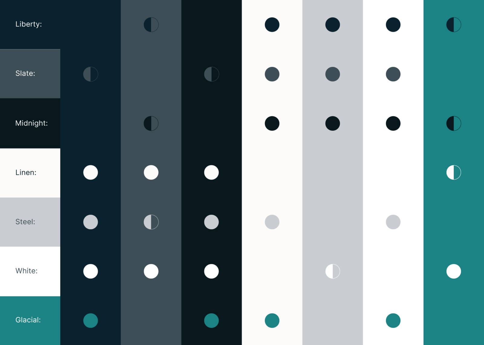
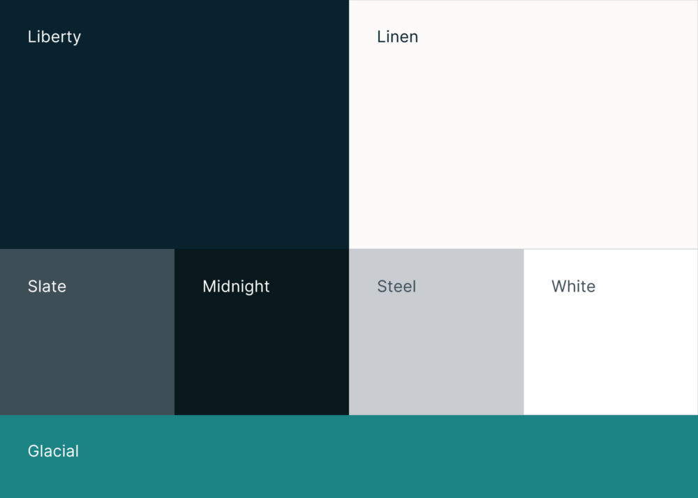
The Discern color palette extends the characteristics of the logos and helps maintain visual consistency throughout the identity. The brands core color combinations are ADA compliant.
Visual Style Guide
A 50+ page style guide accompanies the visual identity. The guide was designed to assist Discern’s staff and marketers with using the new identity and maintaining a cohesive visual experience. In addition to an overview of the logos, color, and typography, the guide contains important suggestions on usage and was flexibly designed to accommodate future branding tools.