Between
Between is a line of true wireless earbuds and part of the next generation of high-quality audio products offered by headphone brand, Status Audio. Continuing my ongoing design work for the brand, I collaborated with Status to accommodate the new line of products by expanding on the brand’s visual identity, packaging, and website.
Summary
Preface
Status is a maker of high quality, minimalist audio products, and one of the fastest-growing direct to consumer headphone brands in the world. I’ve collaborated with Status since 2015 on various ongoing design, development, and creative direction projects. A full project history & case study is available here.
2020–Ongoing
In 2020, Status launched the Between Pro, the first product in their new line and entry into the future of headphones: true wireless earbuds. With plans to release more products under the new brand, Status required visual tools for differentiating Between products from their existing headphones, as well as a way to emphasize the brand’s entry into the new industry-disrupting category.
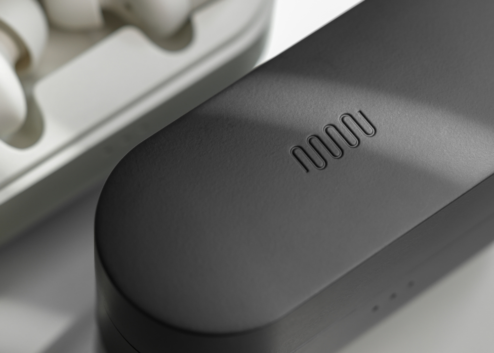
The first and primary task was visualizing the name—should we add Between as subtext below the Status logo, create an entirely new logo, or combine the two as a unifying lock-up? After experimenting with a handful of variations, we landed on Between having its own logo that not only paid homage to the existing branding but could coexist with it on various collateral. Like the Status logo, I designed the new wordmark with characters and curves that mimic the oscillating flow of a simple soundwave pattern. This helped in creating a wordmark that feels unique but, due to the similar characteristics to the original, is easily recognizable. The W in the Between wordmark, which closely resembles a portion of the soundwave pattern, is centered and unites the left and right side as if they were earbuds in use. This is a visual nod to the meaning of the name Between. To show further parity, the original soundwave pattern was used as a secondary logo on charging cases, packaging, and accompanying print materials.
For color, I reorganized the hierarchy of the core Status palette by decreasing the usage of core blues and increasing the prominence of neutral tones from the secondary palette. This allowed us to subtly introduce new color combinations while complementing the existing look and feel.
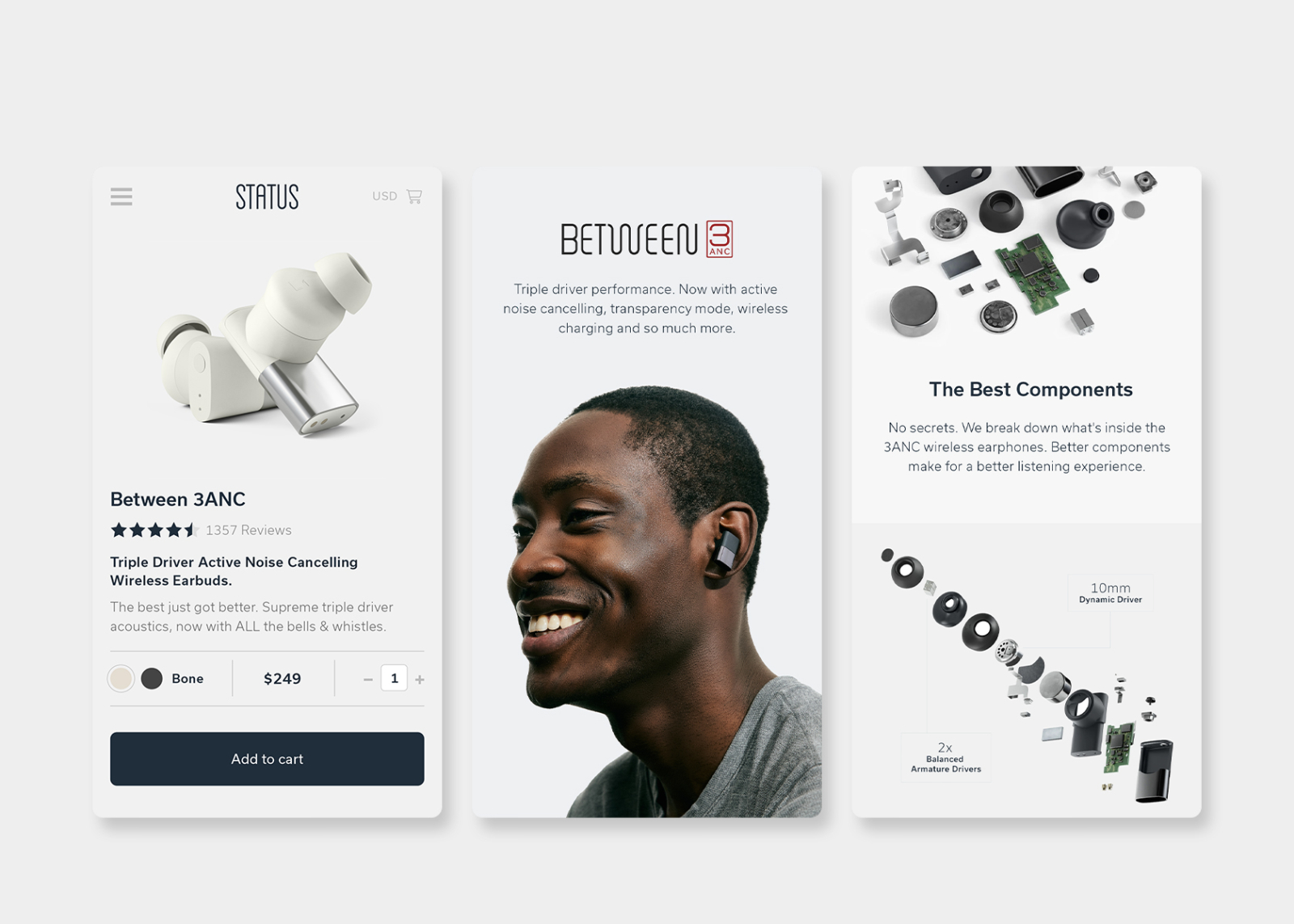
In 2022, the second product in the line, the Between 3ANC, was to be marketed as a vastly improved version of its predecessor, the Between Pro. While slightly smaller and available in two colorways, the 3ANC earbuds were very similar in appearance to the Pros and required further identification for marketing and packaging. I created a new variation of the logo which included a boxed-in typographical “3ANC” lock-up that was added to the end of the wordmark. This new addition to the logo was red which helped differentiate the two products in the line and introduced an additional color to the Between palette. For packaging, we stayed fairly close to the existing platform but redesigned the graphics and layouts to facilitate the smaller boxes and new branding.
In addition to the above, various updates to the website were made to accommodate the launch of the new products, including redesigned banners for product display pages and more conversion-focussed purchasing flows.
Please visit the Status case study for additional info and images.
Front Matter
- Client Status Audio James Bertuzzi
- Location Brooklyn, NY USA
- Industry DNVB Headphones & Audio
- Project Term 2020–Present
- Website status.co
- Related Work Status Audio
- Brand Identity
- Brand Color
- Brand Typography
- Layout & Print
- Logo Design
- Packaging
- Direction
- Art Direction
- Web & Digital
- Shopify
- Shopify Plus
- Web Design
- Web Development
- Industrial Design Friends of
- Photography Dryden Nagtalon Lasse Jensen Kilian Son Aggie Nichols
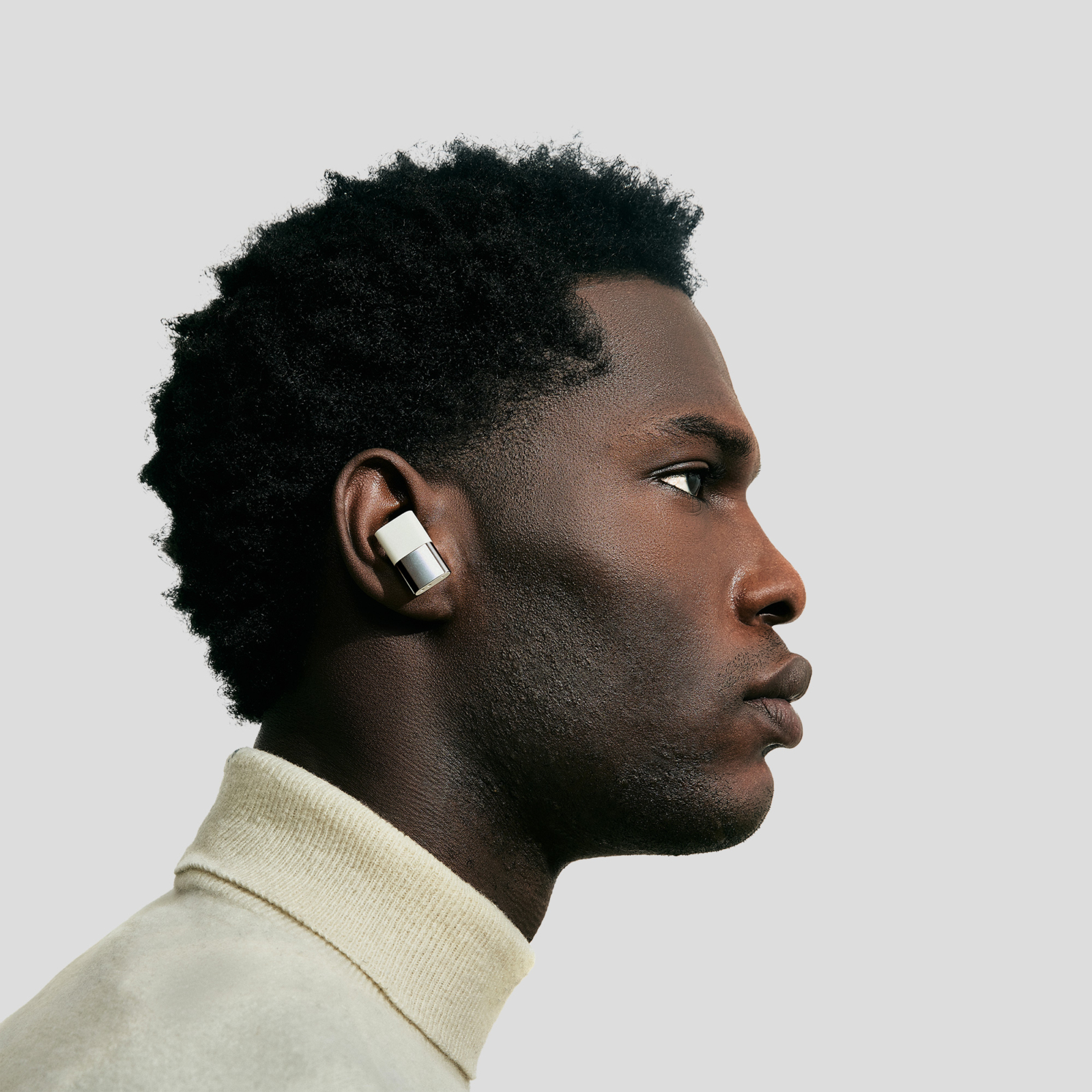
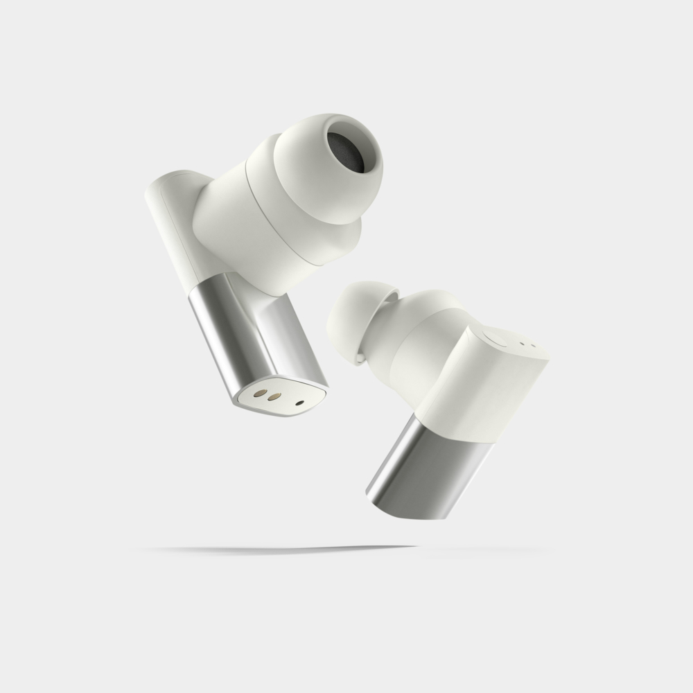
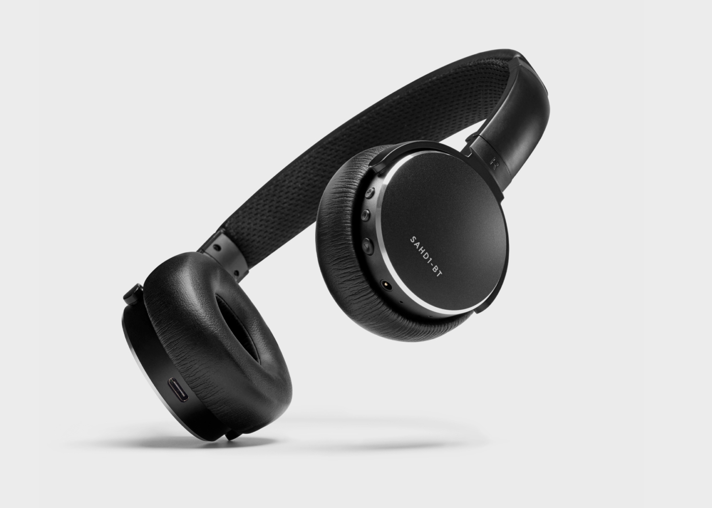
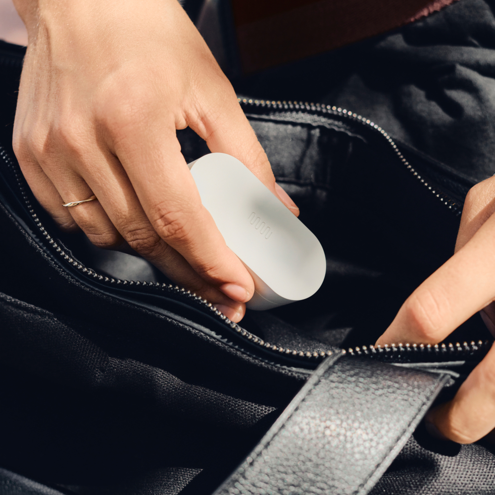 Photo: Lasse Jensen
The Between wordmark was designed with characters and curves that mimic the oscillating flow of a simple soundwave pattern—the same pattern used to create the original Status logo.
The W in Between, which closely resembles a portion of the soundwave pattern, sits centered in the wordmark and unites the left and right side as if they were earbuds in use. This is a visual nod to the meaning of the name Between.
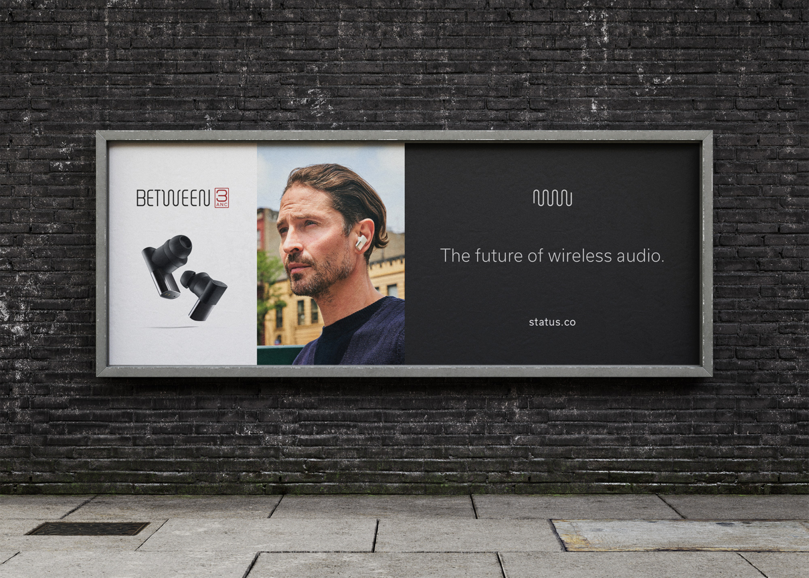
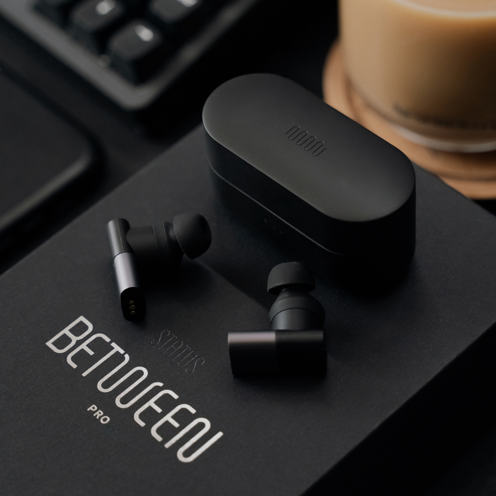 Photo: Dryden Nagtalon
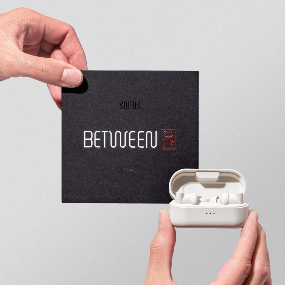 Photo: Aggie Nichols
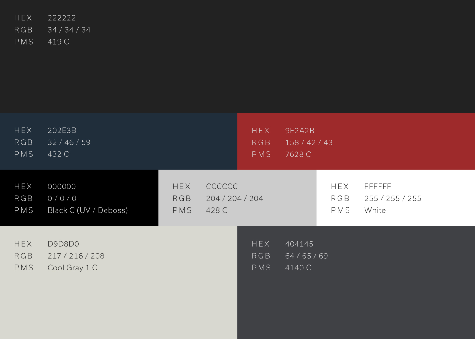
The Between palette, which started as a reorganization of the existing Status brand colors, utilizes various shades of charcoal and gray, a bold red, and subtle hints of the original Status blues. The slight change in brand color allowed us to subtly introduce new combinations while complementing the brand's existing look and feel.

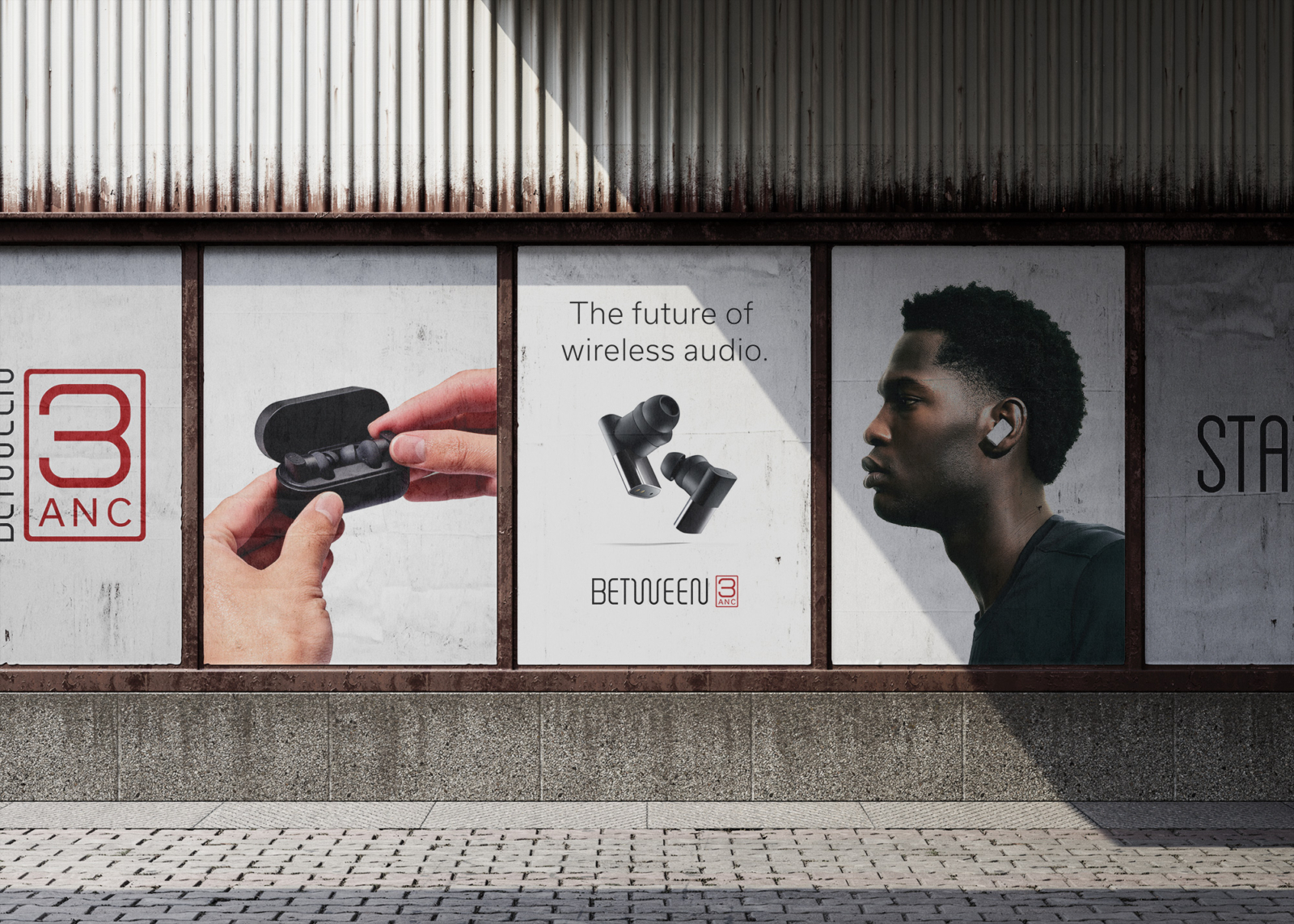
 Photo: Kilian Son
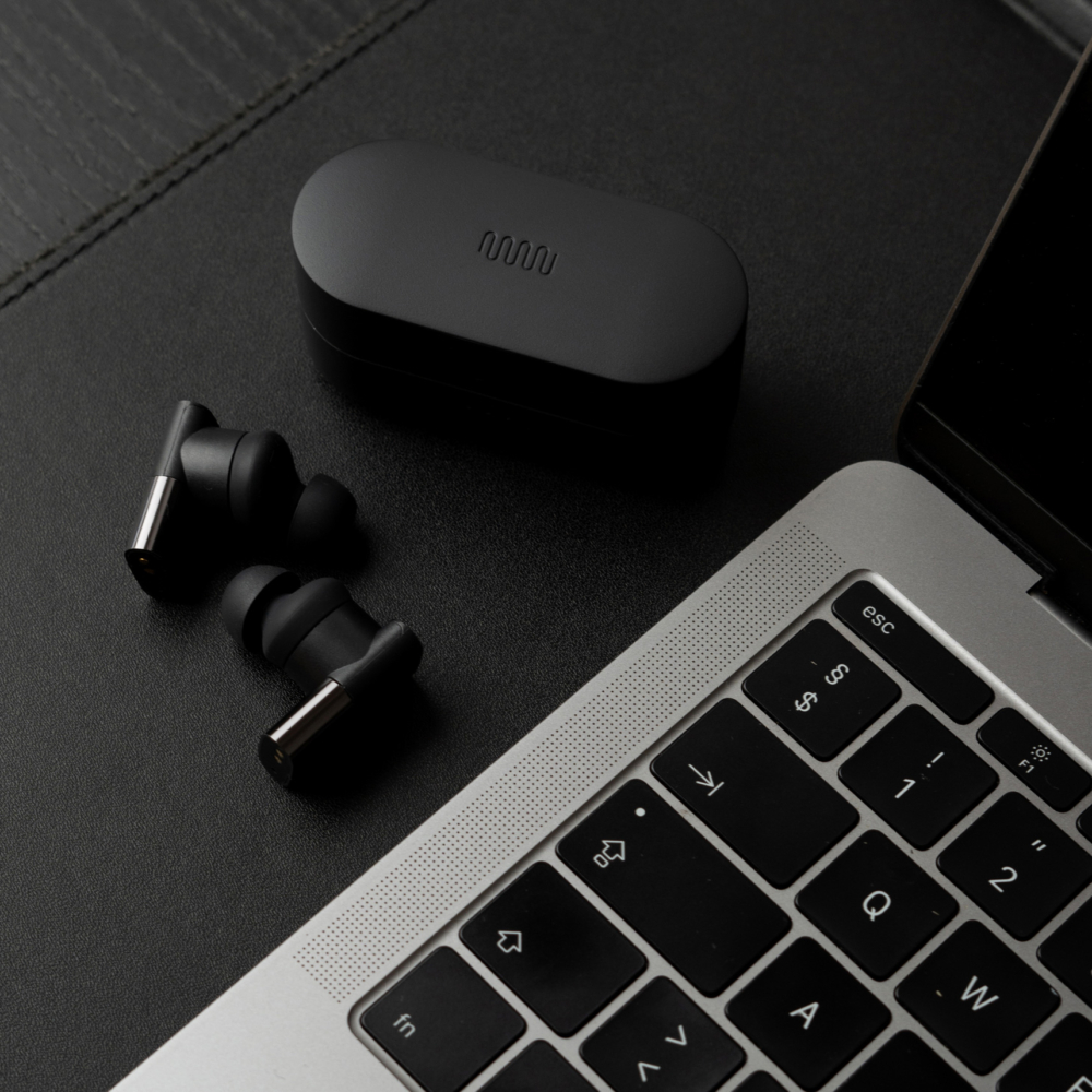 Photo: Lasse Jensen
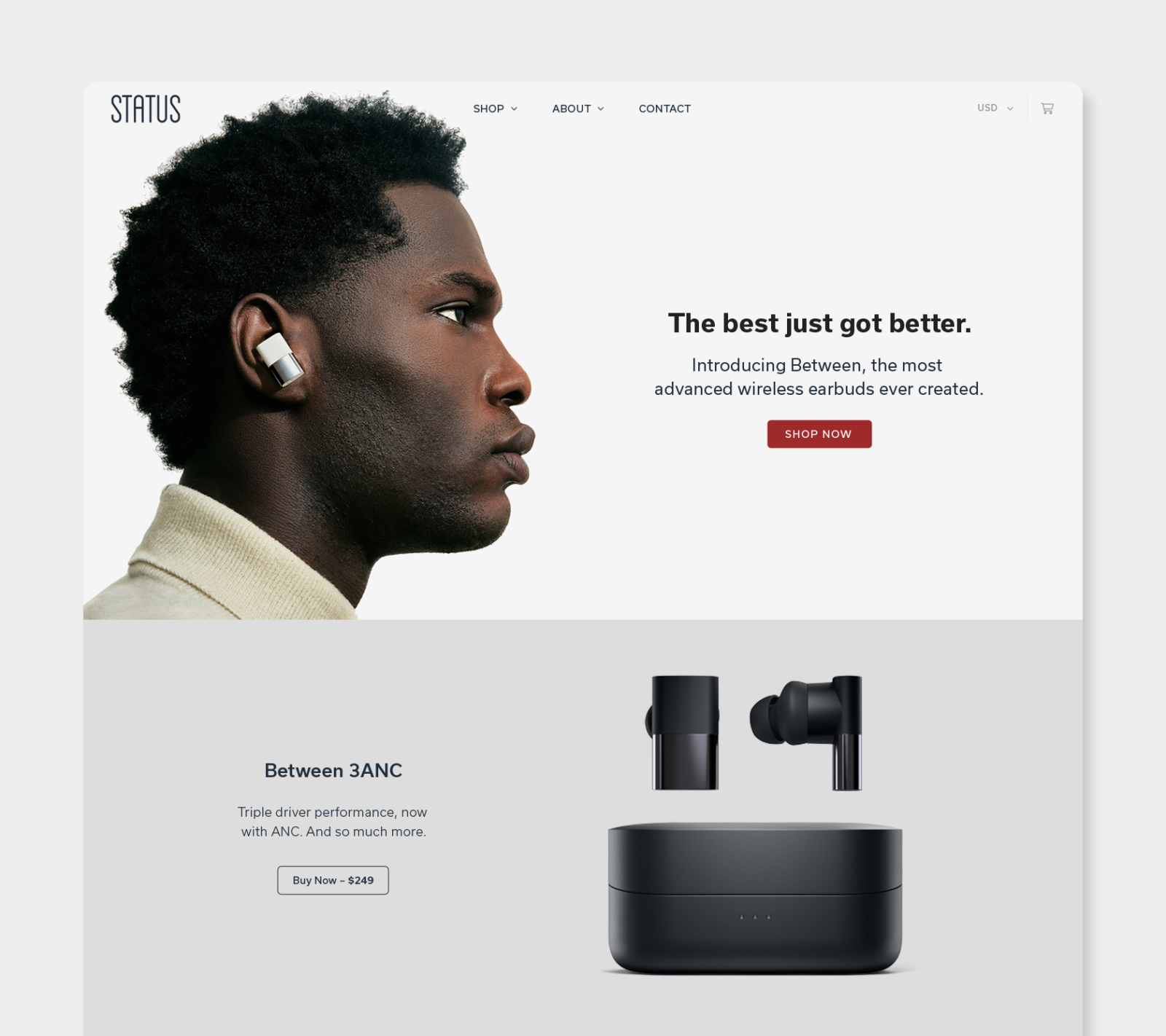
One of the primary features of the custom designed, fully-responsive Status website is the ability to accommodate newly released products and on-the-fly marketing banners (as shown on the homepage during the launch of the Between 3ANC). Learn more about the site by visiting the full case study below.